
Matplotlib
Updated:
matplotlib
- 파이썬에서 데이터를 그래프나 차트로 시각화할 수 있는 라이브러리
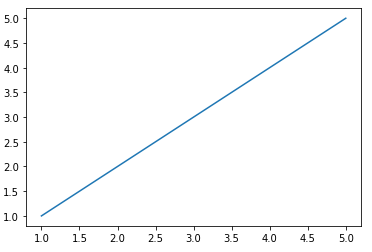
import matplotlib.pyplot as plt

x = [1,2,3,4,5]
y = [1,2,3,4,5]
plt.plot(x, y)
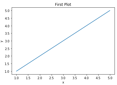
import matplotlib.pyplot as plt

x = [1,2,3,4,5]
y = [1,2,3,4,5]
plt.plot(x, y)
plt.title("First Plot")
plt.xlabel("x")
plt.ylabel("y")
- object oriented 방식
import matplotlib.pyplot as plt

x = [1,2,3,4,5]
y = [1,2,3,4,5]
fig, ax = plt.subplots()
ax.plot(x, y)
ax.set_title("First Plot")
ax.set_xlabel("x")
ax.set_ylabel("y")

fig.set_dpi(300)
fig.savefig("first_plot.png")
- fig는 전체 도화지를 의미한다
- ax는 하나의 그래프를 말한다
- set_dpi()는 도화지의 크기를 결정한다
- savefig()는 도화지를 저장하고 이름을 부여한다
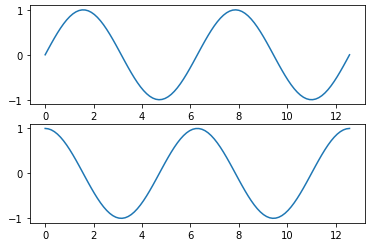
import numpy as np

x = np.linspace(0, np.pi*4, 100)
fig, axes = plt.subplots(2, 1)
axes[0].plot(x, np.sin(x))
axes[1].plot(x, np.cos(x))
matplotlib 그래프들
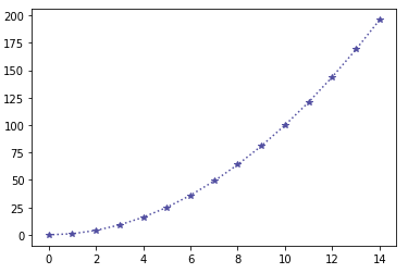
Line plot
fig, ax = plt.subplots()
x = np.arange(15)
y = x ** 2
ax.plot(x, y,
        linestyle = ':',
        marker = "*",
        color = "#524FA1"
)
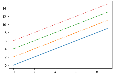
Line style
x = np.arange(10)
fig, ax = plt.subplots()
ax.plot(x, x, linestyle = "-")
# solid
ax.plot(x, x+2, linestyle = "--")
# dashed
ax.plot(x, x+4, linestyle = "-.")
# dashdot
ax.plot(x, x+6, linestyle = ":")
# dotted
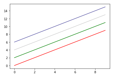
Color
x = np.arange(10)
fig, ax = plt.subplots()
ax.plot(x, x, color = "r")
ax.plot(x, x+2, color = "green")
ax.plot(x, x+4, color = '0.8') # grey
ax.plot(x, x+6, color = "#524FA1")
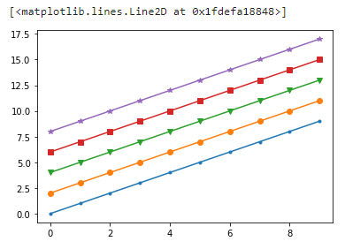
marker
x = np.arange(10)
fig, ax = plt.subplots()
ax.plot(x, x, marker = ".")
ax.plot(x, x+2, marker = "o")
ax.plot(x, x+4, marker = 'v')
ax.plot(x, x+6, marker = "s")
ax.plot(x, x+8, marker = "*")
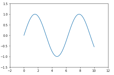
축경계 조정하기
x = np.linsplace(0, 10, 1000)
fig, ax = plt.subplots()
ax.plot(x, np.sin(x))
ax.set_xlim(-2, 12)
ax.set_ylim(-1.5, 1.5)
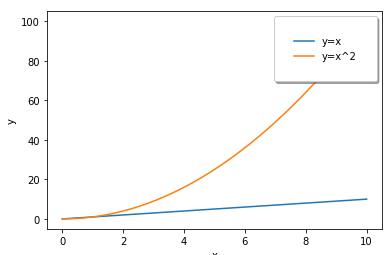
범례
fig, ax = plt.subplots()
ax.plot(x, x, label = 'y=x')
ax.plot(x, x**2, label = 'y=x^2')
# 그래프를 겹쳐서 그릴수 있다
ax.set_xlabel("x")
as.set_ylabel("y")
ax.legend(
  loc = 'upper right', # lower, left
  shadow = True,
  fincybox = True, # 모서리를 둥글게
  borderpad = 2 # css 로 보자면 padding과 같은 개념
)
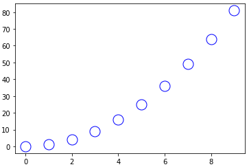
Scatter
fig, ax = plt.subplots()
x = np.arange(10)
ax.plot(
  x, x**2, 'o', # 'o'로 인해서 산점도 그래프로 변한다(세번째 인자)
  markersize = 15,
  markerfacecolor = 'white',
  markeredgecolor = "blue"
)
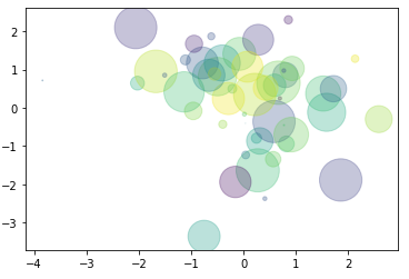
- colors와 size를 지정한 후 만들기
fig, ax = plt.subplots()
x = np.random.randn(50)
y = np.random.randn(50)
colors = np.random.randint(0, 100, 50)
sizes = 500 * np.pi * np.random.rand(50) ** 2
ax.scatter(x, y, c=colors, s=sizes, alpha=0.3)
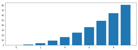
Bar plot
x = np.arange(10)
fig, ax = plt.subplots(figsize=(12, 4))
ax.bar(x, x**2)
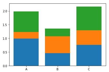
x = np.random.rand(3)
y = np.random.rand(3)
z = np.random.rand(3)
data = [x, y, z]

fig, ax = plt.subplots()
x_ax = np.arange(3)
for i in x_ax:
  ax.bar(x_ax, data[i]),
  bottom = np.sum(data[:i], axis=0)) # 가장 아래의 값은 지금까지의 길이들더한 값
ax.set_xticks(x_ax)
ax.set_xticklabels(['A','B','C'])
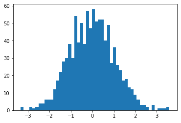
Histogram
fig, ax = plt.subplots()
data = np.random.randn(1000)
ax.hist(data, bins=50)
- 예제
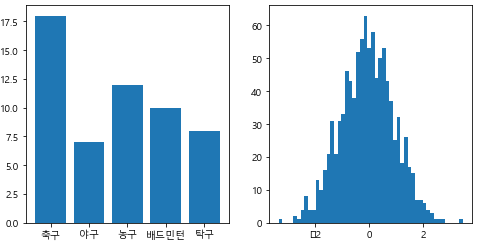
import matplotlib.pyplot as plt
from matplotlib import font_manager, rc
fname="c:/Windows/Fonts/malgun.ttf"
font = fm.FontProperties(fname = fname).get_name()
rc('font', family=font)


x = np.array(["축구", "야구", "농구", "배드민턴", "탁구"])
y = np.array([18, 7, 12, 10, 8])

z = np.random.randn(1000)

fig, axes = plt.subplots(1, 2, figsize=(8, 4)) # fig를 (1, 2)로 분할

# Bar 그래프
axes[0].bar(x, y)
# 히스토그램
axes[1].hist(z, bins = 50)

fig.show()
Matplotlib with Pandas
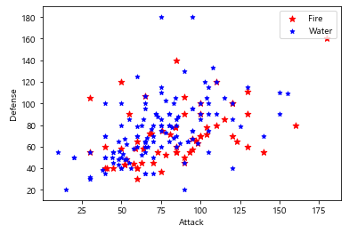
- 불포켓몬과 물포켓몬의 공격력과 방어력 비교
import numpy as np
import pandas as pd
import matplotlib.pyplot as plt
df = pd.read_csv("pokemon.csv")

fire = df[(df['Type 1']=='Fire') | ((df['Type 2'])=='Fire')]
water = df[(df['Type 1']=='Water') | ((df['Type 2'])=='Water')]
fig, ax = plt.subplots()
ax.scatter(fire['Attack'], fire['Defense'], color='R', label='Fire', marker="*", s=50)
ax.scatter(water['Attack'], water['Defense'], color='B', label='Water', marker="*", s=25)
ax.set_xlabel("Attack")
ax.set_ylabel("Defense")
ax.legend(loc="upper right")
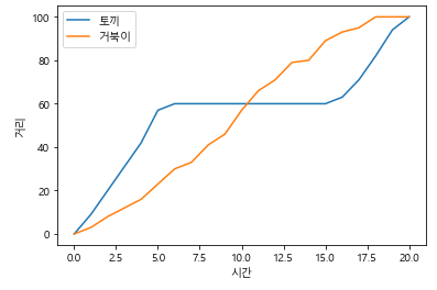
- 토끼와 거북이의 경주 결과
df = pd.read_csv("the_hare_and_the_tortoise.csv")
df.set_index("시간", inplace=True)

rabbit = df["토끼"]
turtle = df["거북이"]

fig, ax = plt.subplots()

ax.plot(ra, label = "토끼")
ax.plot(tu, label = "거북이")
ax.set_xlabel("시간")
ax.set_ylabel("거리")

ax.legend(loc = "upper left")
Leave a comment