
Covia_데이터 시각화 with 경제
Updated:
코로나가 경제에 미친영향
- 코로나 확진자의 통계정보를 간단하게 확인하고 코로나가 경제에 미친 영향을 벤처기업 대출금 데이터와 카드소비 데이터를 바탕으로 알아보자
코로나 통계 요약 정보
- 시각화 자료
import pandas as pd
import matplotlib.pyplot as plt
import missingno as msno
import folium
from folium.plugins import HeatMap
import seaborn as sns
from datetime import datetime
import numpy as np
# Pandas 데이터 프레임에서 float을 소수점 2자리 까지 출력해 준다.
pd.set_option('display.float_format', lambda x: '%.2f' % x)
# 경고를 꺼준다.
import warnings
warnings.filterwarnings('ignore')
plt.rc('font', family='NanumGothic')
# 환자정보
PatientInfo = pd.read_csv(r'.\data\PatientInfo.csv')
# 환자이동경로
PatientRoute = pd.read_csv(r'.\data\PatientRoute.csv')
# 시간대별 확진자, 회복자, 사망자
time = pd.read_csv(r'.\data\time.csv')
# 시간대별 검색어
search_trend = pd.read_csv(r'.\data\SearchTrend.csv')
# 시간대별 나이감염
timeage = pd.read_csv(r'.\data\TimeAge.csv')
# 시간대별 성별감염
timegender = pd.read_csv(r'.\data\TimeGender.csv')
# 시간대별 지역감염
timeprovince = pd.read_csv(r'.\data\TimeProvince.csv')
# 시간대별 카드 사용처와 카드 사용횟수, 총 금액
card = pd.read_csv(r'.\data\card_20200717.csv')
# 시간대별 벤처기업 지원금
venture = pd.read_csv(r'.\data\Venture.csv',encoding='euc-kr')
PatientInfo.head()
| patient_id | global_num | sex | birth_year | age | country | province | city | disease | infection_case | infection_order | infected_by | contact_number | symptom_onset_date | confirmed_date | released_date | deceased_date | state | |
|---|---|---|---|---|---|---|---|---|---|---|---|---|---|---|---|---|---|---|
| 0 | 1000000001 | 2.00 | male | 1964 | 50s | Korea | Seoul | Gangseo-gu | NaN | overseas inflow | 1.00 | NaN | 75 | 2020-01-22 | 2020-01-23 | 2020-02-05 | NaN | released |
| 1 | 1000000002 | 5.00 | male | 1987 | 30s | Korea | Seoul | Jungnang-gu | NaN | overseas inflow | 1.00 | NaN | 31 | NaN | 2020-01-30 | 2020-03-02 | NaN | released |
| 2 | 1000000003 | 6.00 | male | 1964 | 50s | Korea | Seoul | Jongno-gu | NaN | contact with patient | 2.00 | 2002000001 | 17 | NaN | 2020-01-30 | 2020-02-19 | NaN | released |
| 3 | 1000000004 | 7.00 | male | 1991 | 20s | Korea | Seoul | Mapo-gu | NaN | overseas inflow | 1.00 | NaN | 9 | 2020-01-26 | 2020-01-30 | 2020-02-15 | NaN | released |
| 4 | 1000000005 | 9.00 | female | 1992 | 20s | Korea | Seoul | Seongbuk-gu | NaN | contact with patient | 2.00 | 1000000002 | 2 | NaN | 2020-01-31 | 2020-02-24 | NaN | released |
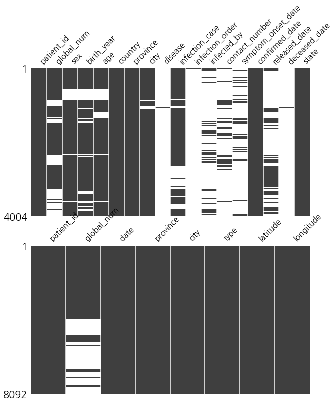
- 결측값을 확인한다
def mson_matrix(df,ax=None):
    msno.matrix(df,ax=ax)

figure, (ax1,ax2) = plt.subplots(nrows=2)
figure.set_size_inches(10,12)

mson_matrix(PatientInfo,ax1)
mson_matrix(PatientRoute,ax2)
- 의미 없는 값을 제거해준다
idx_num = PatientInfo[(PatientInfo['age'] == '100s') | (PatientInfo['age'] == '30')].index
idx_num

PatientInfo.drop(idx_num, inplace = True)
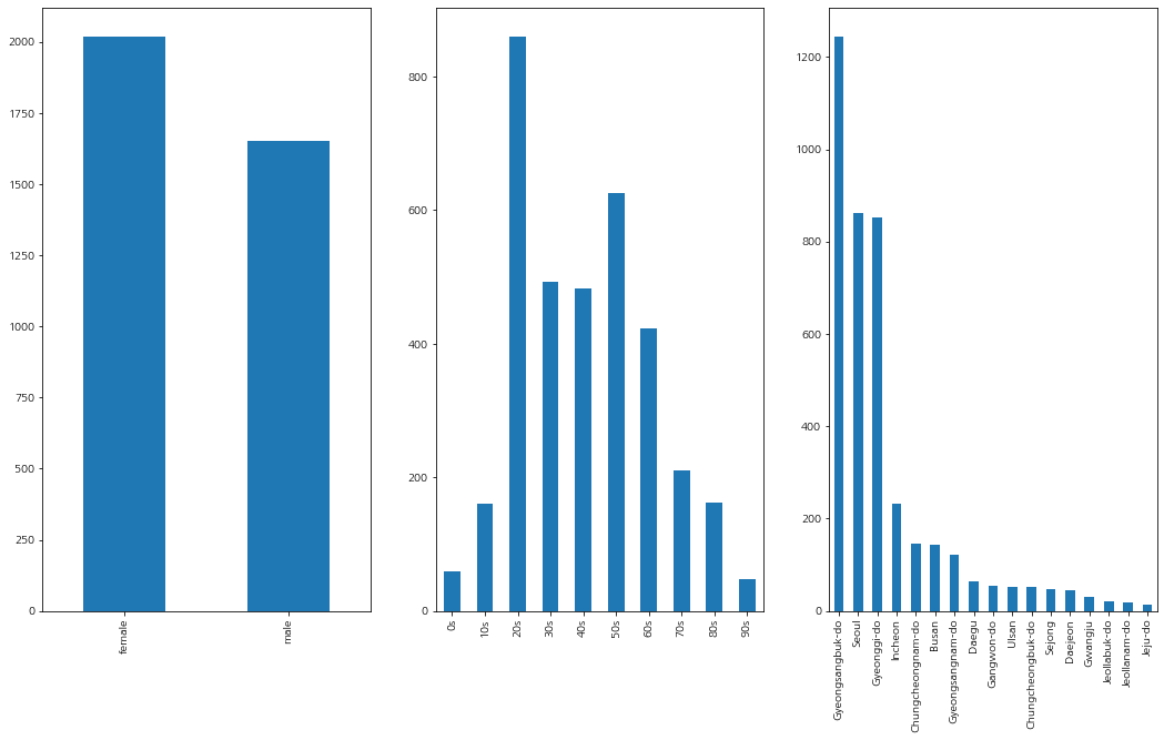
- 현재까지 코로나 확진자들의 특징 요약
def bar_chart(df, ax=None):
    df.plot(kind='bar', ax=ax)

figure, ((ax1,ax2,ax3)) = plt.subplots(nrows=1,ncols=3)
figure.set_size_inches(18,10)

sex = PatientInfo['sex'].value_counts()
age = PatientInfo['age'].value_counts().sort_index()
province = PatientInfo['province'].value_counts()

bar_chart(sex,ax1)
bar_chart(age,ax2)
bar_chart(province,ax3)

plt.show()
- 확진자들의 경로 확인
for i in PatientRoute.index[:]:
    folium.Circle(
        location = PatientRoute.loc[i,['latitude','longitude']],
        radius = 200
    ).add_to(m)
m
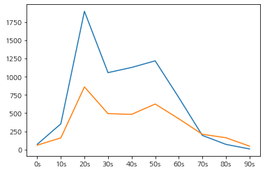
- 나이대별 경로 변경횟수와 나이대별 확진자수의 관계
info_route = pd.merge(PatientInfo,PatientRoute, on='patient_id')
age_route = info_route['age'].value_counts().sort_index()
plt.plot(age_route)
plt.plot(age)
[<matplotlib.lines.Line2D at 0x244ae830490>]
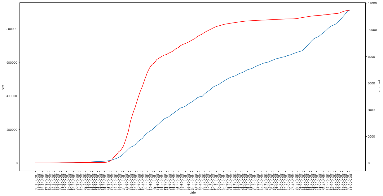
시간의 흐름에 따른 시각화 자료
- 테스트 횟수와 확진자 수 증가량
- 확진자와 회복자
- 검색량과 코로나 확진자
- 나이별 확진자 추세
- 나이별 사망자 추세
- 성별 확진자 추세
- 지역별 확진자 추세
# 1. 테스트 횟수와 확진자 수 증가량
fig, ax = plt.subplots()

plt.rcParams['figure.figsize']=20,10
plt.xticks(rotation = - 90 )

sns.lineplot(x="date", y="test", data=time, ax=ax)
ax2 = ax.twinx()
sns.lineplot(x='date', y='confirmed', data=time, ax=ax2, color='r')
<AxesSubplot:label='5e2640fd-6d2f-4eae-97a5-93e543c1669f', xlabel='date', ylabel='confirmed'>
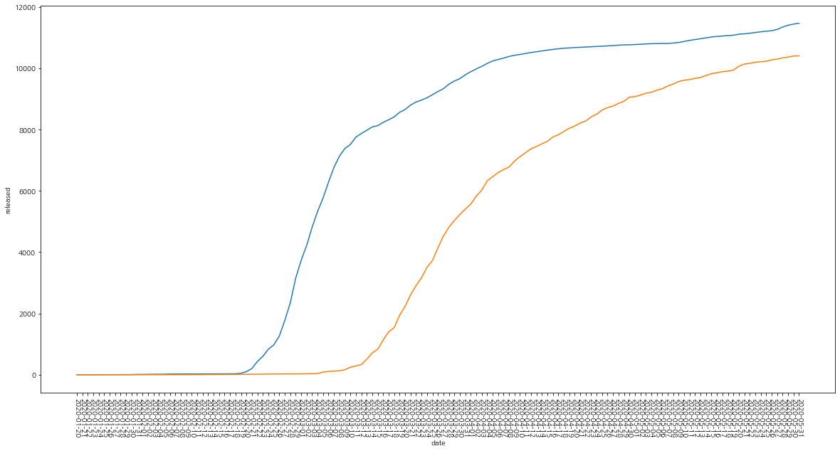
# 2. 확진자와 회복자
plt.rcParams['figure.figsize']=20,10
plt.xticks(rotation = - 90 )
sns.lineplot(x="date", y="confirmed", data=time)

sns.lineplot(x="date", y="released", data=time)
<AxesSubplot:xlabel='date', ylabel='released'>
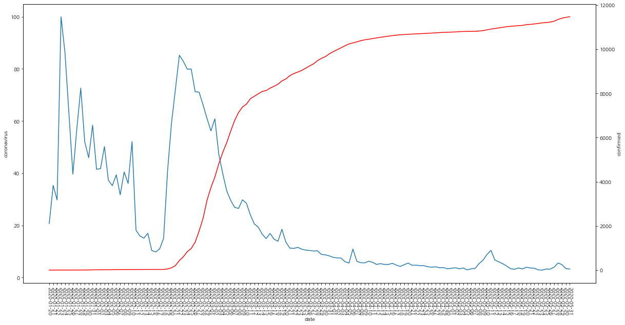
# 3. 검색량과 코로나 확진자
trend_time = pd.merge(time,search_trend, on='date')
fig, ax = plt.subplots()

plt.rcParams['figure.figsize']=20,10
plt.xticks(rotation = - 90 )

sns.lineplot(x="date", y="coronavirus", data=trend_time, ax=ax)
ax2 = ax.twinx()
sns.lineplot(x='date', y='confirmed', data=trend_time, ax=ax2, color='r')
<AxesSubplot:label='9b91c83a-805a-4481-9ff6-1362f83a7ecf', xlabel='date', ylabel='confirmed'>
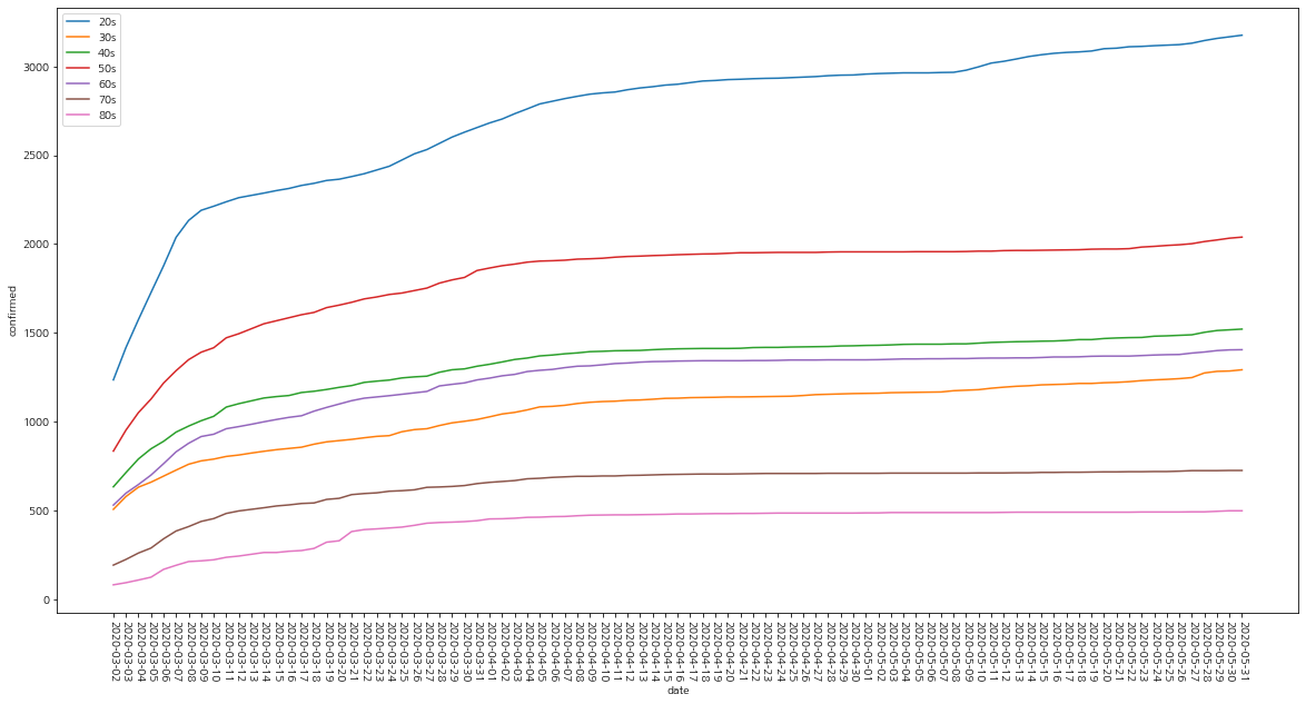
# 4. 나이별 확진자 추세

fig, ax = plt.subplots()

plt.rcParams['figure.figsize']=20,10
plt.xticks(rotation = - 90 )

ages = ['20s','30s','40s','50s','60s','70s','80s']

for age in ages:
    sns.lineplot(x="date", y="confirmed", data=timeage[timeage['age']== age], label=age)
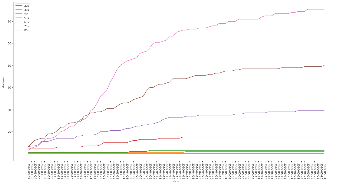
# 5. 나이별 사망자 추세

fig, ax = plt.subplots()

plt.rcParams['figure.figsize']=20,10
plt.xticks(rotation = - 90 )

ages = ['20s','30s','40s','50s','60s','70s','80s']

for age in ages:
    sns.lineplot(x="date", y="deceased", data=timeage[timeage['age']== age], label=age)
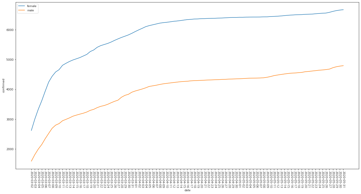
# 6. 성별 확진자 추세

fig, ax = plt.subplots()

plt.rcParams['figure.figsize']=20,10
plt.xticks(rotation = - 90 )

sexs = ['female','male']

for sex in sexs:
    sns.lineplot(x="date", y="confirmed", data=timegender[timegender['sex']== sex], label=sex)
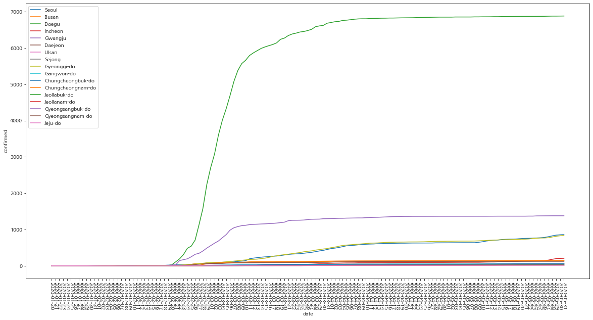
# 7. 지역별 확진자 추세

fig, ax = plt.subplots()

plt.rcParams['figure.figsize']=20,10
plt.xticks(rotation = - 90 )

provinces = ['Seoul', 'Busan', 'Daegu', 'Incheon', 'Gwangju', 'Daejeon',
       'Ulsan', 'Sejong', 'Gyeonggi-do', 'Gangwon-do',
       'Chungcheongbuk-do', 'Chungcheongnam-do', 'Jeollabuk-do',
       'Jeollanam-do', 'Gyeongsangbuk-do', 'Gyeongsangnam-do', 'Jeju-do']

for province in provinces:
    sns.lineplot(x="date", y="confirmed", data=timeprovince[timeprovince['province']== province], label=province)
벤처기업 대출금 데이터 활용
venture.head()
| 일련번호 | 지역 | 업력 | 대출년도 | 대출월 | 대출금액(백만원) | 업종 | |
|---|---|---|---|---|---|---|---|
| 0 | 1 | 강원 | 20년이상 | 2020 | 2 | 200 | 전자 |
| 1 | 2 | 강원 | 20년미만 | 2020 | 2 | 300 | 화공 |
| 2 | 3 | 강원 | 10년미만 | 2020 | 2 | 200 | 전기 |
| 3 | 4 | 강원 | 15년미만 | 2020 | 2 | 290 | 화공 |
| 4 | 5 | 강원 | 7년미만 | 2020 | 2 | 300 | 기타 |
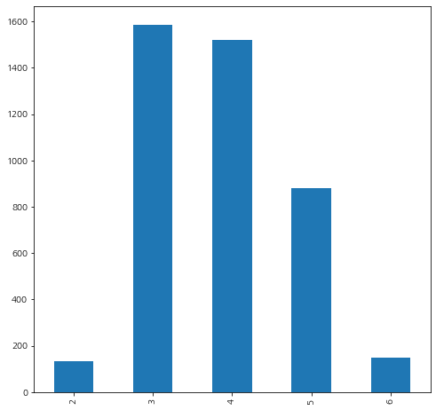
월별 대출을 한 벤처기업의 수
venture_month_count = venture['대출월'].value_counts().sort_index()
plt.rcParams['figure.figsize']=8,8
venture_month_count.plot(kind='bar')
<AxesSubplot:>
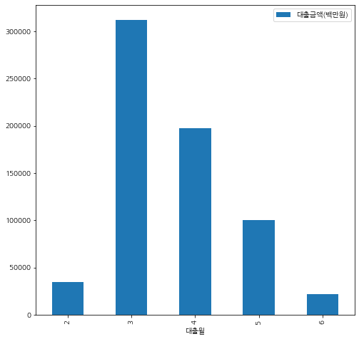
월별 벤처기업 대출금의 총금액
total = venture.pivot_table(values='대출금액'+'('+'백만원'+')',index ='대출월',aggfunc=sum)
total.plot(kind='bar')
<AxesSubplot:xlabel='대출월'>
카드 소비 데이터
sales = card.groupby(['mrhst_induty_cl_nm','receipt_dttm']).sum()['salamt'].reset_index()
sales
sales.receipt_dttm = [datetime.strptime(str(x),'%Y%m%d').month for x in sales.receipt_dttm]
sales = sales.groupby(['mrhst_induty_cl_nm','receipt_dttm']).sum()['salamt'].reset_index()
#sales = sales[sales.receipt_dttm !=6]

total = sales.pivot_table(values=sales[sales['receipt_dttm']==2], index='receipt_dttm',columns='mrhst_induty_cl_nm')
risk2 = total.loc[2] - total.loc[1]
risk3 = total.loc[3] - total.loc[2]
mean_sales = sales.groupby('mrhst_induty_cl_nm').mean()
mean_sales.head()
| receipt_dttm | salamt | |
|---|---|---|
| mrhst_induty_cl_nm | ||
| 1급 호텔 | 3.50 | 927609955.67 |
| 2급 호텔 | 3.50 | 1006486824.17 |
| CATV | 3.50 | 114058693.50 |
| CATV홈쇼핑 | 3.50 | 34443030830.67 |
| L P G | 3.50 | 2424949584.00 |
risk_data = pd.DataFrame({'risk':(risk2 + risk3)/mean_sales['salamt']})
risk_data.values
risk = np.ravel(risk_data.values, order='C')
risk_data = pd.DataFrame({'index':sales['mrhst_induty_cl_nm'].unique(),'risk':risk})
risk_data = risk_data.dropna(axis=0)
risk_data
risk_data_remove =  risk_data.drop(risk_data[(risk_data.risk < 1) & (risk_data.risk > -1)].index)
plt.rcParams['figure.figsize']=20,10
plt.xticks(rotation = - 90 )
plt.grid(True)
plt.bar(risk_data_remove['index'],risk_data_remove['risk'])
<BarContainer object of 35 artists>
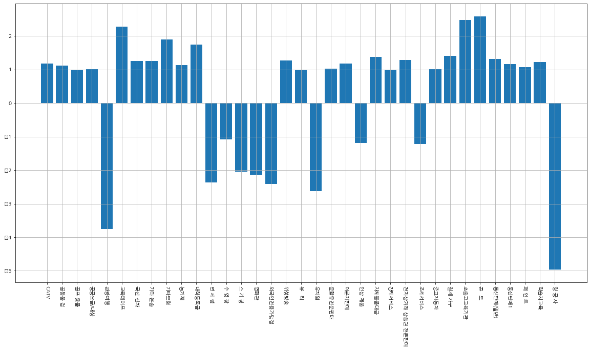
- 이동과 관련된 ‘관광여행’과 ‘항공사’의 카드 사용량이 확실히 준것을 확인할 수 있다
Leave a comment