[튜토리얼4] 그래디언트 부스팅 트리(Gredient Boosted tree): 모델 이해하기
이번 튜토리얼의 목표는 다음과 같습니다:
- 부스팅 트리 모델을 해석하는 방법을 알아보겠습니다.
- 부스팅 트리 모델에 데이터셋을 적용해보겠습니다.
from __future__ import absolute_import, division, print_function, unicode_literals

import warnings
warnings.simplefilter('ignore')

import numpy as np
import pandas as pd

from IPython.display import clear_output

import tensorflow as tf
tf.random.set_seed(123)

import matplotlib.pyplot as plt
import seaborn as sns
sns_colors = sns.color_palette('colorblind')

from numpy.random import uniform, seed
from scipy.interpolate import griddata
목차
- 부스팅 트리를 해석하는 방법
- 타이타닉 데이터셋 불러오기
- 피쳐 열과 입력 함수를 만들고 에스티메이터(Estimator) 학습시키기
- 3.1 데이터 전처리
- 3.2 파이프라인 구축하기
- 3.3 모델 학습시키기
- 모델 해석과 시각화
- 4.1 국소적(local) 해석
- 4.2 전역적(global) 해석
- 이익 기반 피쳐 중요도
- DFC 절대값의 평균 구하기
- 순열 피쳐 중요도
- 4.3 모델 시각화
- 결론
1. 부스팅 트리를 해석하는 방법
모델을 해석하는 데에는 다음의 두 가지 관점이 있습니다.
- 국소적(local) 해석은 개별 데이터 수준에서 모델의 예측을 이해하는 것입니다
- 전역적(global) 해석은 모델을 전체적으로 이해하는 것을 의미합니다.
이러한 기법들은 머신러닝(ML) 실무자가 모델을 개발하는 데에 있어 편향과 버그를 탐지하는 데 도움이 될 수 있습니다.
국소적(local) 해석을 위해 각 객체(instance)당 기여도를 생성하고 시각화하는 방법을 학습할 것입니다. 이를 피쳐 중요도와 구별하기 위해 이러한 값을 DFCs(directional feature contributions)라고 합니다.
전역적(global) 해석을 위해 이익 기반 피쳐 중요도와 순열 피쳐 중요도를 검색, 시각화해보고 집계된 DFCs를 표시합니다.
2. 타이타닉 데이터셋 불러오기
성별, 나이, 클래스 등의 특성을 고려하여 승객 생존을 예측하는 것이 목표인 타이타닉 데이터 세트를 사용할 것입니다.
# 데이터셋을 불러옵니다.
dftrain = pd.read_csv('https://storage.googleapis.com/tf-datasets/titanic/train.csv')
dfeval = pd.read_csv('https://storage.googleapis.com/tf-datasets/titanic/eval.csv')
y_train = dftrain.pop('survived')
y_eval = dfeval.pop('survived')

# 불러온 데이터 중 500개의 학습 데이터와 200개의 검증 데이터를 사용합니다.
dftrain = dftrain.iloc[:500]
y_train = y_train.iloc[:500]
dfeval = dfeval.iloc[:200]
y_eval = y_eval.iloc[:200]
3. 피쳐 열과 입력 함수를 만들고 에스티메이터(Estimator) 학습시키기
3.1 데이터 전처리
숫자 열은 있는 그대로 사용하고 범주형 변수는 원-핫 인코딩을 통해 변환하여 피쳐 열을 생성합니다.
fc = tf.feature_column
CATEGORICAL_COLUMNS = ['sex', 'n_siblings_spouses', 'parch', 'class', 'deck',
                       'embark_town', 'alone']
NUMERIC_COLUMNS = ['age', 'fare']

def one_hot_cat_column(feature_name, vocab):
    return fc.indicator_column(
        fc.categorical_column_with_vocabulary_list(feature_name,
                                                 vocab))
feature_columns = []
for feature_name in CATEGORICAL_COLUMNS:
    # 범주형 피쳐는 원-핫 인코딩이 필요합니다.
    vocabulary = dftrain[feature_name].unique()
    feature_columns.append(one_hot_cat_column(feature_name, vocabulary))

for feature_name in NUMERIC_COLUMNS:
    feature_columns.append(fc.numeric_column(feature_name,
                                           dtype=tf.float32))
3.2 파이프라인 구축하기
판다스(Pandas)의 데이터를 직접적으로 읽어오기 위해 tf.data API에 있는 from_tensor_slices 메서드를 사용해서 입력 함수를 만듭니다.
# 데이터셋이 작으므로 모든 배치(batch)를 사용합니다.
NUM_EXAMPLES = len(y_train)

# 입력 함수 만들기
def make_input_fn(X, y, n_epochs=None, shuffle=True):
    def input_fn():
        dataset = tf.data.Dataset.from_tensor_slices((X.to_dict(orient='list'), y))
        if shuffle:
            dataset = dataset.shuffle(NUM_EXAMPLES)
        # n_epochs로 지정한만큼 데이터셋을 반복해서 학습합니다
        dataset = (dataset
            .repeat(n_epochs)
            .batch(NUM_EXAMPLES))
        return dataset
    return input_fn

# 훈련 데이터와 검증 데이터의 입력 함수입니다.
train_input_fn = make_input_fn(dftrain, y_train)
eval_input_fn = make_input_fn(dfeval, y_eval, shuffle=False, n_epochs=1)
3.3 모델 학습시키기
params = {
  'n_trees': 50,
  'max_depth': 3,
  'n_batches_per_layer': 1,
  # DFC를 가져오려면 center_bias = True로 설정해서
  # 모델이 피쳐를 적용하기 전에 초기 예측을 하도록 합니다
  'center_bias': True
}

est = tf.estimator.BoostedTreesClassifier(feature_columns, **params)

# 모델을 학습시킵니다.
est.train(train_input_fn, max_steps=100)

# 모델 검증하기
results = est.evaluate(eval_input_fn)
clear_output()
pd.Series(results).to_frame()
데이터의 크기가 메모리에 맞으면 boosted_trees_classifier_train_in_memory 함수를 이용하는 것이 성능상 더 좋습니다. 그러나 학습 시간이 길어도 문제가 없거나 데이터셋이 너무 커서 분산 학습을 하려고 한다면 위에 나와 있는 tf.estimator.BoostedTrees API를 사용합니다.
이 메소드는 전체 데이터셋을 다루므로 입력 데이터를 배치화하지 않습니다.
in_memory_params = dict(params)
in_memory_params['n_batches_per_layer'] = 1

# 인메모리 입력 함수는 배치를 사용하지 않습니다.
def make_inmemory_train_input_fn(X, y):
    y = np.expand_dims(y, axis=1)
    def input_fn():
        return dict(X), y
    return input_fn
train_input_fn = make_inmemory_train_input_fn(dftrain, y_train)

# 모델을 학습시킵니다.
est = tf.estimator.BoostedTreesClassifier(
    feature_columns,
    train_in_memory=True,
    **in_memory_params)

est.train(train_input_fn)
clear_output()
print(est.evaluate(eval_input_fn))
4. 모델 해석과 시각화
4.1 국소적(local) 해석
Palczewska et al과 Saabas의 랜덤 포레스트 해석처럼 개별 예측을 설명하는 DFC를 출력해보겠습니다.(이 방법은 사이킷런(scikit-learn)에 있는 treeinterpreter 패키지의 랜덤 포레스트에서도 사용할 수 있습니다.)
DFCs는 다음 코드를 통해 생성됩니다.
pred_dicts = list(est.experimental_predict_with_explanations(pred_input_fn))
pred_dicts = list(est.experimental_predict_with_explanations(eval_input_fn))
# DFC를 판다스 데이터프레임으로 생성합니다.
labels = y_eval.values
probs = pd.Series([pred['probabilities'][1] for pred in pred_dicts])
df_dfc = pd.DataFrame([pred['dfc'] for pred in pred_dicts])
df_dfc.describe().T
DFCs의 좋은 점은 기여의 합 + 편향이 주어진 데이터 대한 예측과 같다는 것입니다.
# DFC의 합 + 편향 == 예측 확률
bias = pred_dicts[0]['bias']
dfc_prob = df_dfc.sum(axis=1) + bias
np.testing.assert_almost_equal(dfc_prob.values,
                               probs.values)
개별 승객에 대한 DFC를 시각화합니다. 기여도의 방향성을 기준으로 색을 부호화하여 그림을 보기 좋게 만들고 그림에 피쳐 값을 추가합니다.
# 시각화의 표준 양식입니다.
def _get_color(value):
    """양의 DFC를 초록색으로 음의 DFC를 빨간색으로 표시합니다."""
    green, red = sns.color_palette()[2:4]
    if value >= 0: return green
    return red

def _add_feature_values(feature_values, ax):
    """피쳐 값을 플롯의 왼쪽에 배치합니다."""
    x_coord = ax.get_xlim()[0]
    OFFSET = 0.15
    for y_coord, (feat_name, feat_val) in enumerate(feature_values.items()):
        t = plt.text(x_coord, y_coord - OFFSET, '{}'.format(feat_val), size=12)
        t.set_bbox(dict(facecolor='white', alpha=0.5))
    from matplotlib.font_manager import FontProperties
    font = FontProperties()
    font.set_weight('bold')
    t = plt.text(x_coord, y_coord + 1 - OFFSET, 'feature\nvalue',
    fontproperties=font, size=12)

def plot_example(example):
    TOP_N = 8 # 위에서부터 8개의 피쳐를 봅니다.
    sorted_ix = example.abs().sort_values()[-TOP_N:].index  # 중요도를 정렬합니다.
    example = example[sorted_ix]
    colors = example.map(_get_color).tolist()
    ax = example.to_frame().plot(kind='barh',
                          color=[colors],
                          legend=None,
                          alpha=0.75,
                          figsize=(10,6))
    ax.grid(False, axis='y')
    ax.set_yticklabels(ax.get_yticklabels(), size=14)

    # 피쳐 값들을 넣습니다.
    _add_feature_values(dfeval.iloc[ID][sorted_ix], ax)
    return ax
# 시각화 결과입니다.
ID = 182
example = df_dfc.iloc[ID]  # 검증 데이터셋에서 i번째 데이터를 선택합니다.
TOP_N = 8  # 위에서 부터 8개의 피쳐를 확인합니다.
sorted_ix = example.abs().sort_values()[-TOP_N:].index
ax = plot_example(example)
ax.set_title('Feature contributions for example {}\n pred: {:1.2f}; label: {}'.format(ID, probs[ID], labels[ID]))
ax.set_xlabel('Contribution to predicted probability', size=14)
plt.show()
더 큰 기여도는 모델의 예측에 더 큰 영향을 미칩니다. 음의 기여는 이 예제의 피쳐 값이 모델의 예측력을 감소시킨 반면 양의 기여값은 모델의 예측력을 증가시켰음을 나타냅니다.
또한 바이올린 플롯으로 데이터의 DFC와 전체 분포를 비교해볼 수 있습니다.
# 시각화의 표준 양식입니다
def dist_violin_plot(df_dfc, ID):
    # plot의 크기를 설정합니다.
    fig, ax = plt.subplots(1, 1, figsize=(10, 6))

    # 데이터 프레임을 만듭니다.
    TOP_N = 8  # 상위를 차지한 8개 피쳐를 확인합니다.
    example = df_dfc.iloc[ID]
    ix = example.abs().sort_values()[-TOP_N:].index
    example = example[ix]
    example_df = example.to_frame(name='dfc')

    # 전체 분포에 대한 기여도를 넣습니다.
    parts=ax.violinplot([df_dfc[w] for w in ix],
                 vert=False,
                 showextrema=False,
                 widths=0.7,
                 positions=np.arange(len(ix)))
    face_color = sns_colors[0]
    alpha = 0.15
    for pc in parts['bodies']:
        pc.set_facecolor(face_color)
        pc.set_alpha(alpha)

    # 피쳐 값을 넣습니다.
    _add_feature_values(dfeval.iloc[ID][sorted_ix], ax)

    # 국소적 기여도를 넣습니다.
    ax.scatter(example,
              np.arange(example.shape[0]),
              color=sns.color_palette()[2],
              s=100,
              marker="s",
              label='contributions for example')

    # 범례를 설정합니다.
    ax.plot([0,0], [1,1], label='eval set contributions\ndistributions',
          color=face_color, alpha=alpha, linewidth=10)
    legend = ax.legend(loc='lower right', shadow=True, fontsize='x-large',
                     frameon=True)
    legend.get_frame().set_facecolor('white')

    # 플롯을 구성합니다.
    ax.set_yticks(np.arange(example.shape[0]))
    ax.set_yticklabels(example.index)
    ax.grid(False, axis='y')
    ax.set_xlabel('Contribution to predicted probability', size=14)
우리의 데이터에 대한 그림을 그려봅시다.
dist_violin_plot(df_dfc, ID)
plt.title('Feature contributions for example {}\n pred: {:1.2f}; label: {}'.format(ID, probs[ID], labels[ID]))
plt.show()
LIME이나 shap과 같은 도구를 이용하여 모델에 대한 개별 예측을 이해하는 데 도움이 될 수 있습니다.
4.2 전역적(global) 해석
국소적 해석과 같은 개별적인 예측말고 모델을 전체적으로 이해해야 할 수도 있습니다. 이를 위해서는 다음과 같은 정보를 사용합니다:
est.experimental_feature_importances을 사용하여 계산한 이익 기반(gain-based) 피쳐 중요도est.experimental_predict_with_explanations을 사용하여 집계한 DFC- 순열(permutation) 피쳐 중요도
이익 기반 피쳐 중요도는 특정 피쳐에서 분할할 때의 손실 변화를 측정합니다
반면에 순열 피쳐 중요도는 각 피쳐를 하나씩 섞어 검증 데이터에 대한 모델의 성능을 평가하고 섞인 피쳐로 인한 모델 성능의 변화를 관찰하며 중요도를 계산합니다.
일반적으로 이익 기반 피쳐 중요도보다 순열 피쳐 중요도가 더 선호됩니다. 하지만 두 방법 모두 측정 규모 또는 범주 수에 따라 잠재적인 예측 변수가 달라지거나 피쳐들이 상관관계가 있는 경우에는 신뢰할 수 없습니다.
- 이익 기반 피쳐 중요도
텐서플로우 부스팅 트리 에스티메이터에는 이익 기반 피쳐 중요도를 계산하는est.experimental_feature_importances메소드가 내장되어 있습니다.
importances = est.experimental_feature_importances(normalize=True)
df_imp = pd.Series(importances)

# 중요도를 시각화합니다.
N = 8
ax = (df_imp.iloc[0:N][::-1]
    .plot(kind='barh',
          color=sns_colors[0],
          title='Gain feature importances',
          figsize=(10, 6)))
ax.grid(False, axis='y')
- DFC 절대값의 평균구하기
DFC의 절대값의 평균을 구하여 전역적 수준에서의 영향력을 이해할 수 있습니다.
# 플롯 그리기
dfc_mean = df_dfc.abs().mean()
N = 8
sorted_ix = dfc_mean.abs().sort_values()[-N:].index  #절대값으로 평균을 구하고 정렬합니다.
ax = dfc_mean[sorted_ix].plot(kind='barh',
                       color=sns_colors[1],
                       title='Mean |directional feature contributions|',
                       figsize=(10, 6))
ax.grid(False, axis='y')
피쳐 값이 변함에 따라 DFC가 어떻게 달라지는지도 확인할 수 있습니다.
FEATURE = 'fare'
feature = pd.Series(df_dfc[FEATURE].values, index=dfeval[FEATURE].values).sort_index()
ax = sns.regplot(feature.index.values, feature.values, lowess=True)
ax.set_ylabel('contribution')
ax.set_xlabel(FEATURE)
ax.set_xlim(0, 100)
plt.show()
- 순열 피쳐 중요도
def permutation_importances(est, X_eval, y_eval, metric, features):
    """컬럼 별로 값들을 shuffle(섞고) 검증 데이터에서의 영향을 확인해봅니다.
    source: http://explained.ai/rf-importance/index.html
    """
    baseline = metric(est, X_eval, y_eval)
    imp = []
    for col in features:
        save = X_eval[col].copy()
        X_eval[col] = np.random.permutation(X_eval[col])
        m = metric(est, X_eval, y_eval)
        X_eval[col] = save
        imp.append(baseline - m)
    return np.array(imp)

def accuracy_metric(est, X, y):
    """텐서플로우 에스티메이터 정확도"""
    eval_input_fn = make_input_fn(X,
                                  y=y,
                                  shuffle=False,
                                  n_epochs=1)
    return est.evaluate(input_fn=eval_input_fn)['accuracy']
features = CATEGORICAL_COLUMNS + NUMERIC_COLUMNS
importances = permutation_importances(est, dfeval, y_eval, accuracy_metric,
                                      features)
df_imp = pd.Series(importances, index=features)

sorted_ix = df_imp.abs().sort_values().index
ax = df_imp[sorted_ix][-5:].plot(kind='barh', color=sns_colors[2], figsize=(10, 6))
ax.grid(False, axis='y')
ax.set_title('Permutation feature importance')
plt.show()
4.3 모델 시각화
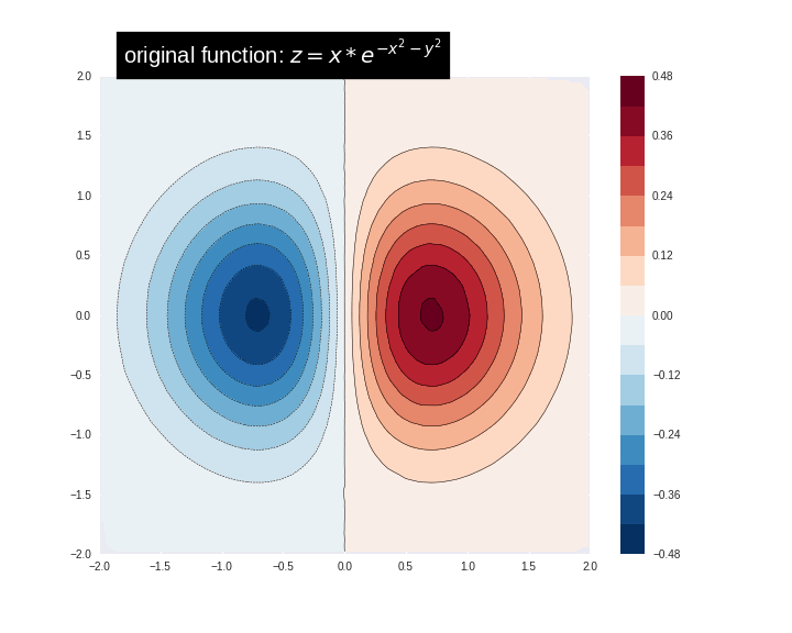
먼저 다음 공식을 사용하여 훈련 데이터를 생성, 사용해봅시다:
\[z=x* e^{-x^2 - y^2}\]여기서 (z)는 예측하려는 종속 변수이고 (x) 와 (y)는 피쳐입니다.
# 가짜 데이터를 만듭니다.
seed(100)

#500개의 점
npts = 500
x = uniform(-2, 2, npts)
y = uniform(-2, 2, npts)
z = x*np.exp(-x**2 - y**2)
# 훈련 데이터를 준비합니다.
df = pd.DataFrame({'x': x, 'y': y, 'z': z})

xi = np.linspace(-2.0, 2.0, 50),
yi = np.linspace(-2.1, 2.1, 60),
xi,yi = np.meshgrid(xi, yi)

df_predict = pd.DataFrame({
    'x' : xi.flatten(),
    'y' : yi.flatten(),
})
predict_shape = xi.shape
def plot_contour(x, y, z, **kwargs):
    # 데이터를 격자화(grid)합니다.
    plt.figure(figsize=(10, 8))
    # 격자화한 데이터에 등고선을 그리고 동일하지 않은 데이터 지점에 점을 표시합니다.
    plt.contour(x, y, z, 15, linewidths=0.5, colors='k')
    CS = plt.contourf(x, y, z, levels = 15, cmap='RdBu_r')
    plt.colorbar(CS)  # 컬러바를 그립니다.
    # 데이터 포인트들을 그립니다.
    plt.xlim(-2, 2)
    plt.ylim(-2, 2)
함수를 시각화할 수 있습니다. 빨간색은 더 큰 함수 값에 해당합니다.
zi = griddata((x, y), z, (xi, yi), method='linear')
plot_contour(xi, yi, zi)
plt.scatter(df.x, df.y, marker='.')
plt.title('Contour on training data')
plt.show()
fc = [tf.feature_column.numeric_column('x'),
      tf.feature_column.numeric_column('y')]
def predict(est):
    """주어진 에스티메이터로 예측한 값"""
    predict_input_fn = lambda: tf.data.Dataset.from_tensors(dict(df_predict))
    preds = np.array([p['predictions'][0] for p in est.predict(predict_input_fn)])
    return preds.reshape(predict_shape)
먼저 선형 모델에 적용해봅시다.
train_input_fn = make_input_fn(df, df.z)
est = tf.estimator.LinearRegressor(fc)
est.train(train_input_fn, max_steps=100)
plot_contour(xi, yi, predict(est))
잘 맞지 않습니다. 다음으로 GBDT 모델에 적용시키고 모델이 함수에 얼마나 적합한지 알아보겠습니다.
n_trees = 1 #@param {type: "slider", min: 1, max: 80, step: 1}

est = tf.estimator.BoostedTreesRegressor(fc, n_batches_per_layer=1, n_trees=n_trees)
est.train(train_input_fn, max_steps=5)
clear_output()
plot_contour(xi, yi, predict(est))
plt.text(-1.8, 2.1, '# trees: {}'.format(n_trees), color='w', backgroundcolor='black', size=20)
plt.show()
메모리 제한으로 인해 트리 수와 데이터의 수를 증가시킬 수 없지만 만약 트리와 데이터의 수를 크게 증가시키면 모델의 예측이 기본 함수에 점점 가까워지는 것을 확인할 수 있습니다.
8. 결론
이번 튜토리얼에서는 부호화된 피쳐 기여도와 피쳐 중요도 함수를 사용하여 부스팅 트리 모델을 해석하는 방법을 배웠습니다. 이러한 기법은 피쳐가 모델의 예측에 어떤 영향을 미치는지에 대한 인사이트(insight)을 제공합니다.
Copyright 2019 The TensorFlow Authors.
#@title Licensed under the Apache License, Version 2.0 (the "License");
# you may not use this file except in compliance with the License.
# You may obtain a copy of the License at
#
# https://www.apache.org/licenses/LICENSE-2.0
#
# Unless required by applicable law or agreed to in writing, software
# distributed under the License is distributed on an "AS IS" BASIS,
# WITHOUT WARRANTIES OR CONDITIONS OF ANY KIND, either express or implied.
# See the License for the specific language governing permissions and
# limitations under the License.